I’m currently working on an internal app for Codurance, which started as a pet project while I was working with my previous client. I started the project with one simple goal: to make it work. After six or seven months of trying to put it all together in my spare time, I ended up with a skeleton of a working app. However, I wasn’t entirely satisfied with my work. Even though I had been test-driving all the code and all my ViewControllers were as light as I could imagine, I thought it wasn’t enough. So I decided to carry out a big refactoring and apply the VIPER architectural pattern.
So what’s VIPER?
VIPER stands for View, Interactor, Presenter, Entity, and Router, and it’s a version of the clean architecture applied for iOS. It’s not my intention to take a deep-dive into VIPER in this article, but if you are interested in learning more, (here)[https://www.objc.io/issues/13-architecture/viper/], you have a good definition of the architecture, and here you can find a good explanation that can help you decide if you want to use it in your app or not. The section “Benefits of VIPER” in this article explain quite well why I decided to use VIPER.
Make it work
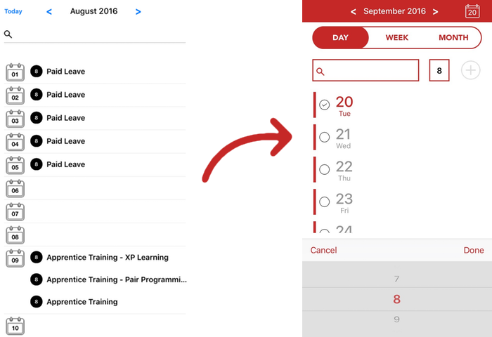
So as I explained, originally my main objective had been to make it work. And I did. With my big refactoring in place, I finished my goals for the app in no time, having the major features working. The app looked like this at that time:
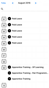
This version had several problems: The way to add or delete new TimeEntries was completely obscure for a new user: you had to swipe the cell to see the buttons. I was using this pod: SWTableViewCell to achieve this. I was happy because my app was working, but I was sad because it wasn’t an app that I would like to show off. So I had a talk with our UI expert, and we decided to start iterating till we get the UI into a more satisfactory state.
First Iteration: Copy Google Calendar
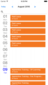
Even though this app is not a calendar app, it all revolves around time entry. So we first looked at apps that had the objective of entering timed slots of work, but most of them were more like Excel sheets than apps. And because my initial idea was to have a list of TimeEntries, we looked at the Google Calendar App. The simplicity and clean design called to us, so we decided that could be a good first step to do a similar design and iterate from there. It looks better, doesn’t it? But there were still usability issues I wanted to address… I was insisting on having this swipe version because as a user, I prefer apps that have all at hand and I don’t have to go into several different views to achieve something. So I was kind of insisting on just having a one view app.
Second Iteration: Remove hidden functionality

So with this in mind, and playing a little with colors (I must confess that the colors here are my fault 😊 ), we added the functionality to the only view of our app. Giulia helped me to improve usability and the result wasn’t that hard to implement. She also decided to have 3 different views of the data since we have 3 types of user: the ones that update their hours daily, the ones that do it by week, and the ones that only do it once per month.
Third Iteration: Trying to have insertion in just one line
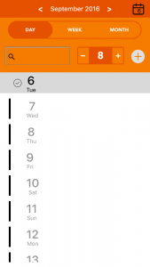
As you can see I’m very bad at choosing colors, but right then we were more worried about having everything that was related to a new insertion on just one line and about keeping it simple. The delete functionality stayed in the swipe, but that is an expected behavior from an iOS app, so we were ok with that.
Fourth iteration: Playing with colors
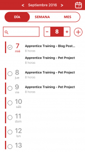
Finally, Giulia dedicated some time to me (I guess she was horrified with my colors choices 😜 ) and decide to have a look at the colors. Notice the difference? Me too…
But we were not yet happy with the insertion line. The field to search activities was too small and the stepper was too big in comparison.
Fifth Iteration: Add a picker view
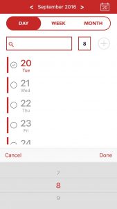
The fact that now we have a PickerView gave us the space we needed to have a big text field. It all looks more harmonious and is still doing what I had in mind: just use one view to do everything in the app.
What VIPER had to do in all this
As you can see, I had to change the UI several times and some were radical changes (for example, we had a version where we tried to put the insertion line in the bottom, after the list). But because I had everything really independent and a good separation of concerns, I just needed to change my UI elements and wire them into my ViewController and there you go, everything else would work like a charm. The longest that it took me to make these changes was two days, partly because I had some problems with AutoLayout.
Conclusion
The decision to adopt the VIPER architecture was a good decision, and even though I don’t have a big set of new features coming up, I really appreciate the fact that I always know exactly where I have to go to find something in the app. We still have some functionality that we want to add to the app, but I think that the design is largely done. Another thing that I felt was that I didn’t want to “kill the designer” when Giulia appeared with new ideas that would make me change all of the design. It was really simple to adopt and painless. And that’s definitely a good thing to have.

